Lucy’s Gluten Free
What we did
Brand Identity
Packaging
Signage and Wayfinding
Visual Communications
Digital Design
Lucy’s Gluten Free began out of necessity when she noticed that one of her children had developed a sensitivity to wheat. After struggling to find any GF bread that didn’t feel like it was a compromise in taste and texture compared to normal bread, Lucy decided to make her own and—after many failed attempts—finally got to the point where she felt that the bread she was baking was better than anything she had tried or bought.
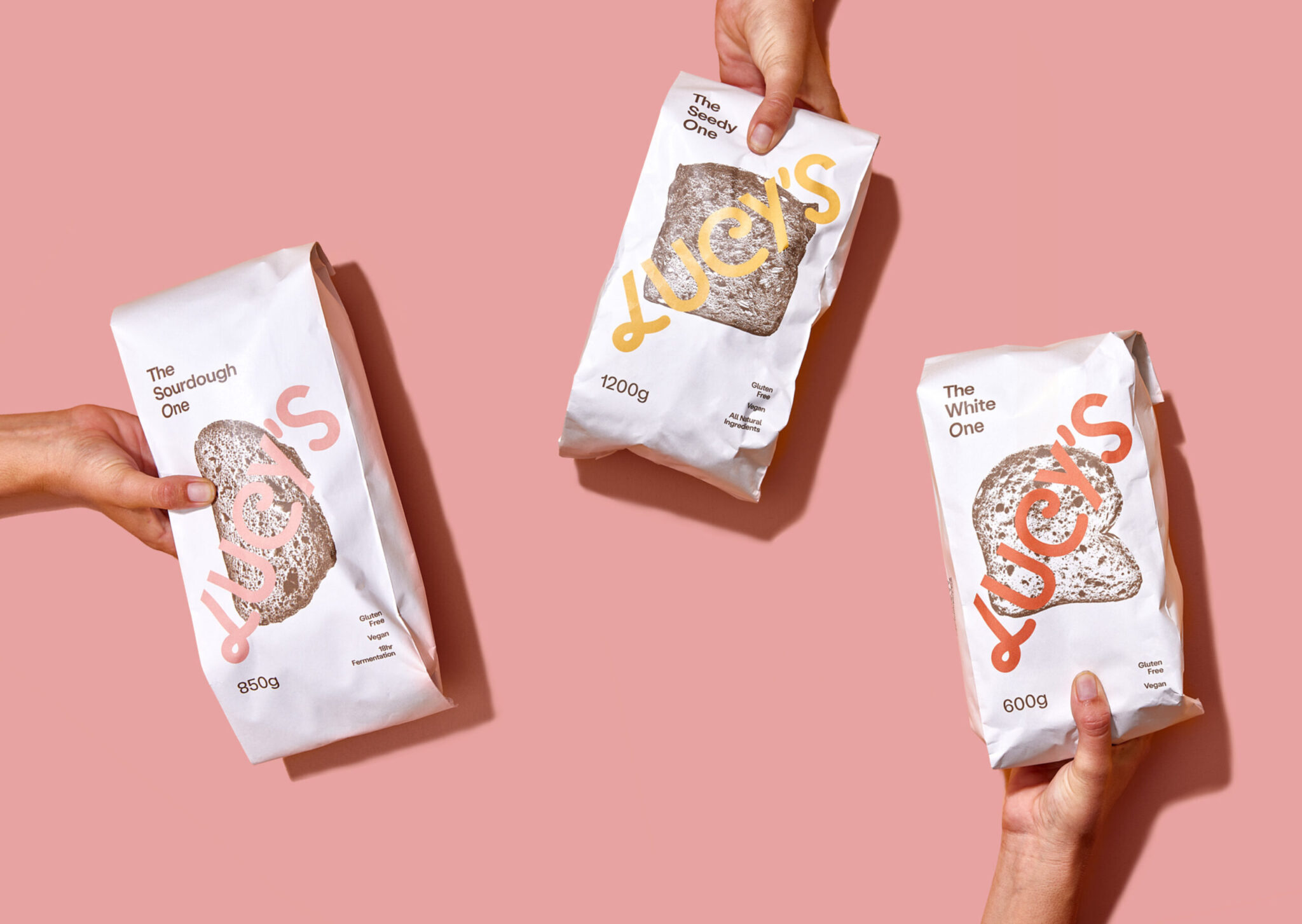
All of Lucy’s loaves are made by hand, so each loaf is unique in shape, a detail we picked up through the exaggerated and oblong glyphs found within the brand typeface. With a focus on using fewer, but better ingredients, the brand places the bread front and centre. The packaging is deliberately minimal, typographic and environmentally minded, celebrating the natural ingredients and using a pop of colour to compliment the loaf variants.
The logotype is inspired by the process of stretching, folding and trimming of dough during the bread-making process. The brand vibe is earthy and can-do, yet bright and breezy—inspired by the maker Lucy and her bountiful Whaingaroa garden.